
The intricate interplay between visual design elements and human cognition has long been a subject of fascination. Among these elements, typography stands as a potent force, possessing the remarkable ability to shape our emotions, perceptions, and decision-making processes. This phenomenon, known as font psychology, delves into the profound impact that the mere selection of a typeface can have on our subconscious minds.
In our visually-driven world, the written word holds immense power, transcending its literal meaning and evoking a multitude of psychological responses. From evoking a sense of trust and authority to conveying playfulness and creativity, the choice of font can subtly influence how we perceive and interpret information. This article aims to unravel the intricacies of font psychology, exploring its historical roots, its underlying principles, and its practical applications in various domains.
The history of typography is intertwined with the evolution of human civilization itself. From the ancient Sumerian cuneiform inscriptions etched into clay tablets to the illuminated manuscripts of medieval scribes, the art of letterforms has undergone a remarkable transformation. Each era has left an indelible mark on the development of typography, imbuing fonts with cultural associations and emotional resonances.
One of the most significant milestones in the history of fonts was the invention of the printing press by Johannes Gutenberg in the 15th century. This revolutionary technology paved the way for the mass production of books, enabling the dissemination of knowledge on an unprecedented scale. The typefaces employed during this period, such as the iconic Blackletter and Old Style serif fonts, became synonymous with tradition, authority, and intellectualism.
As society progressed, new typeface styles emerged, reflecting the changing cultural and technological landscapes. The advent of the Industrial Revolution and the rise of modernism gave birth to sans-serif fonts, which embodied the ideals of simplicity, functionality, and progress. These clean, geometric typefaces became the visual language of the modern age, adorning the logos and branding of countless companies and organizations.
At the core of font psychology lies the intricate relationship between visual stimuli and human cognition. Our brains are hardwired to interpret and assign meaning to the shapes, forms, and patterns that we encounter, including the letterforms that constitute fonts. This innate ability to derive emotional and psychological associations from visual cues is a testament to the remarkable complexity of the human mind.
One of the key principles underlying font psychology is the concept of cross-modal correspondence. This phenomenon refers to the way our senses interact and influence one another, leading us to associate certain shapes and sounds with specific emotions or characteristics. For instance, the “bouba/kiki” effect, a well-known experiment in psychology, demonstrates how humans tend to associate rounded shapes with softer, more melodic sounds (like “bouba”), while angular shapes are often associated with harsher, more abrupt sounds (like “kiki”).
This principle extends to the realm of typography, where the shapes and forms of letterforms can evoke specific emotional responses. Serif fonts, with their traditional and ornate flourishes, may convey a sense of elegance, authority, and sophistication, while sans-serif fonts, with their clean lines and minimalist aesthetic, can project a sense of modernity, efficiency, and approachability.
To truly appreciate the nuances of font psychology, it is essential to understand the psychological associations and connotations associated with various font styles. While individual fonts may evoke unique reactions, certain overarching themes and emotional resonances can be attributed to the broader categories of typefaces.
Serif fonts, characterized by their small decorative strokes or “serifs” at the ends of letterforms, have long been associated with tradition, authority, and intellectualism. Their roots can be traced back to the early days of printing, when they were widely used in books, newspapers, and other scholarly publications. This historical lineage has imbued serif fonts with a sense of timelessness and respectability.
Subcategories of serif fonts, such as Old Style, Transitional, and Modern, each carry their own unique emotional resonances. Old Style serifs, with their warm and organic forms, may evoke a sense of heritage and classicism, while Modern serifs, with their high contrast and sharp edges, can convey a sense of boldness and dynamism.
Examples of serif fonts and their associated psychological traits:
Buy Serif Fonts at Vampfonts.com and Get 20% OFF
Don’t miss this chance to upgrade your design arsenal – visit Vampfonts.com/font-category/serif/ now and use code VAMP20 to claim your exclusive discount!


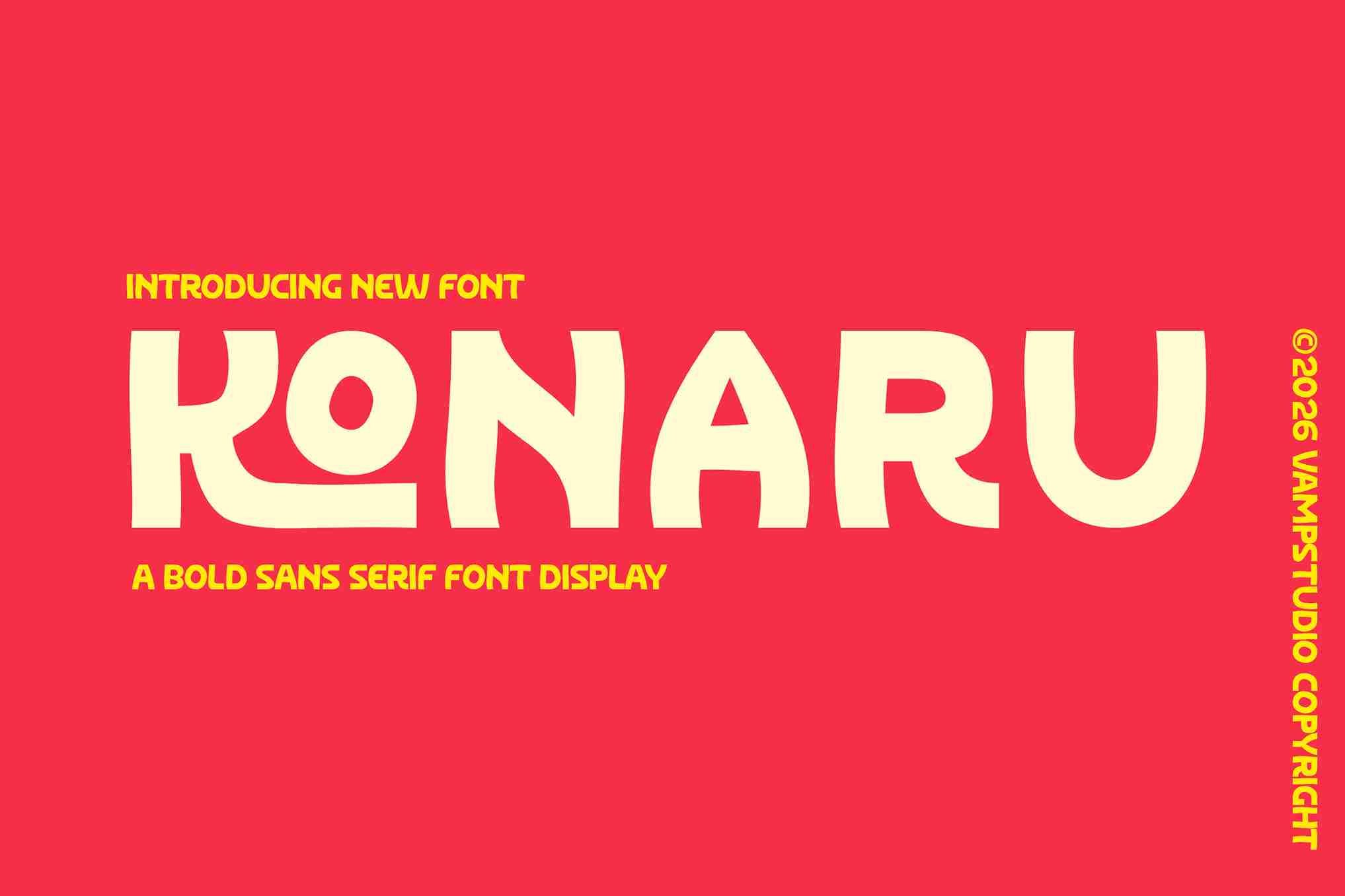
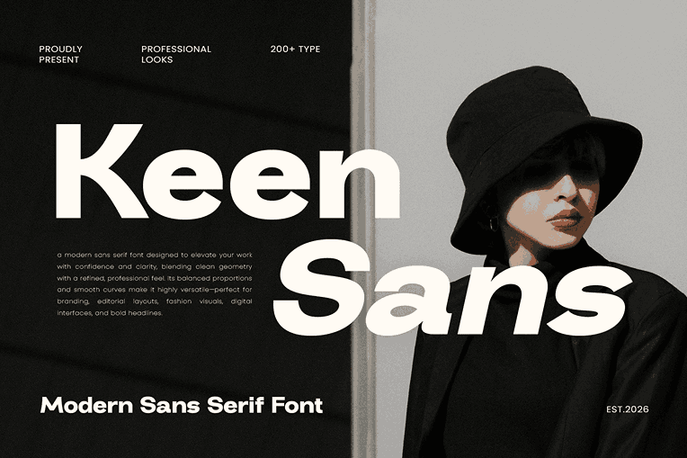
In contrast to their serif counterparts, sans-serif fonts lack the decorative flourishes and instead embrace a clean, minimalist aesthetic. Born out of the modernist movement of the early 20th century, these fonts embodied the ideals of simplicity, functionality, and progress.
Sans-serif fonts, with their geometric forms and straightforward lines, project a sense of modernity and efficiency. They are often associated with technology, innovation, and forward-thinking concepts, making them a popular choice for branding and marketing in the digital age.
Subcategories of sans-serif fonts, such as Humanist, Grotesque, and Geometric, each offer their own unique psychological associations. Humanist sans-serifs, with their organic curves and calligraphic influences, may evoke a sense of warmth and approachability, while Geometric sans-serifs, with their strict adherence to geometric forms, can convey a sense of precision and order.
Examples of sans-serif fonts and their associated psychological traits:
Buy Sans Serif Fonts at Vampfonts.com and Get 20% OFF
Transform your visual communication, make every pixel count, and stand out in a crowded digital world – visit Vampfonts.com/font-category/sans-serif/ now and use code VAMP20 to claim your exclusive discount!
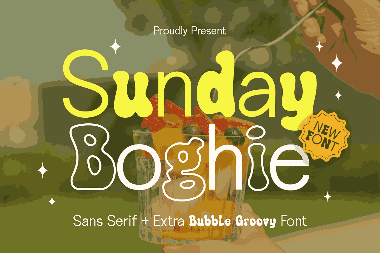
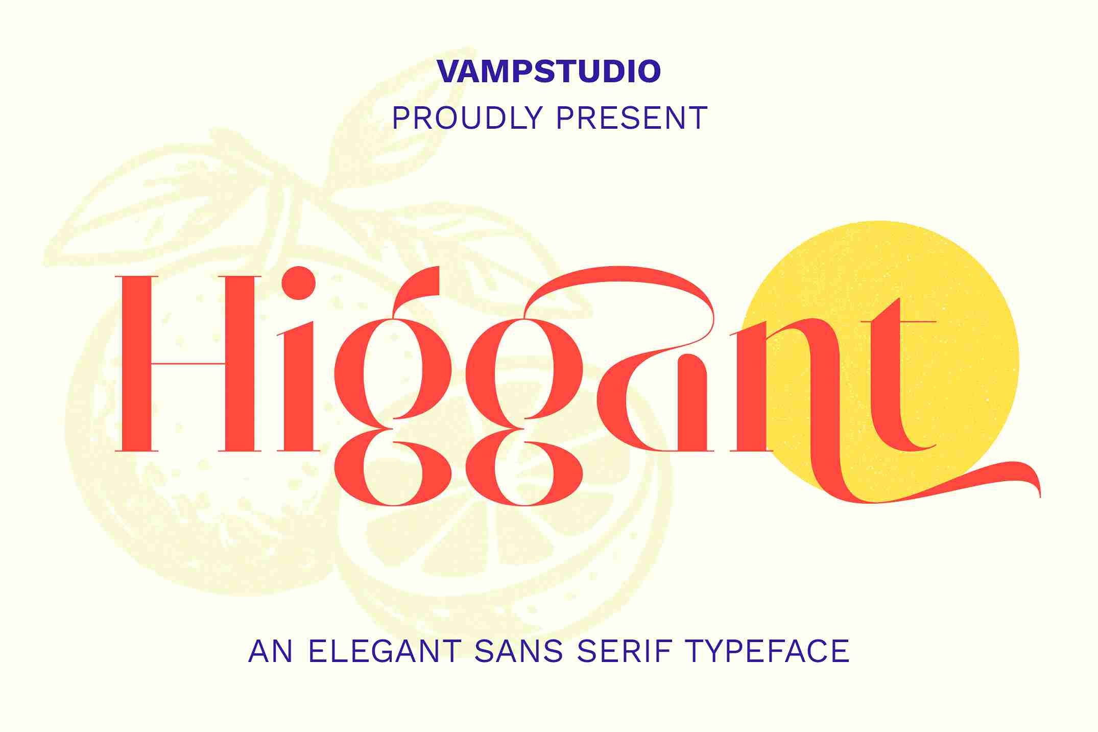
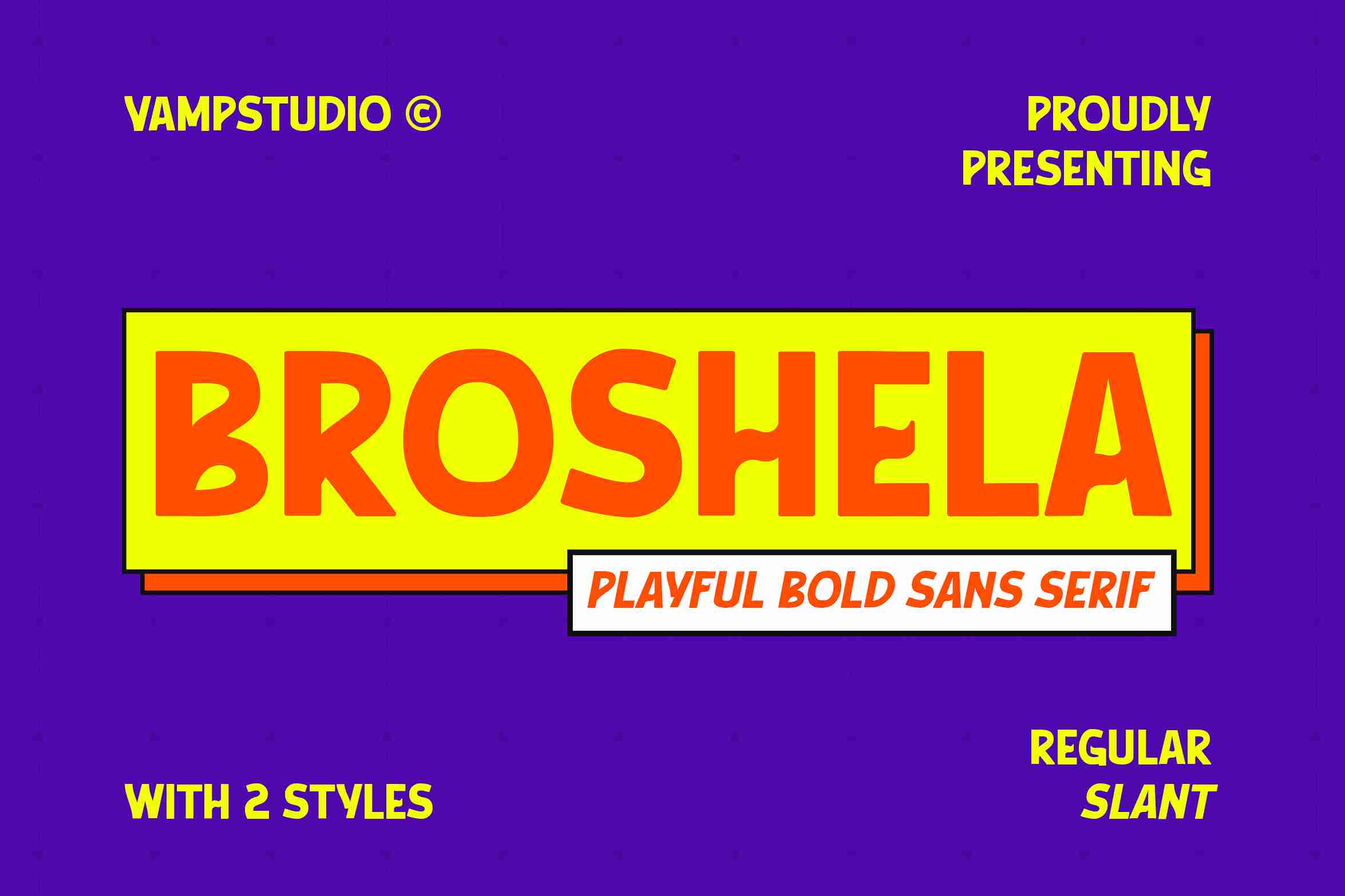
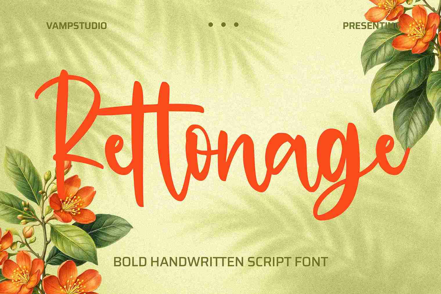
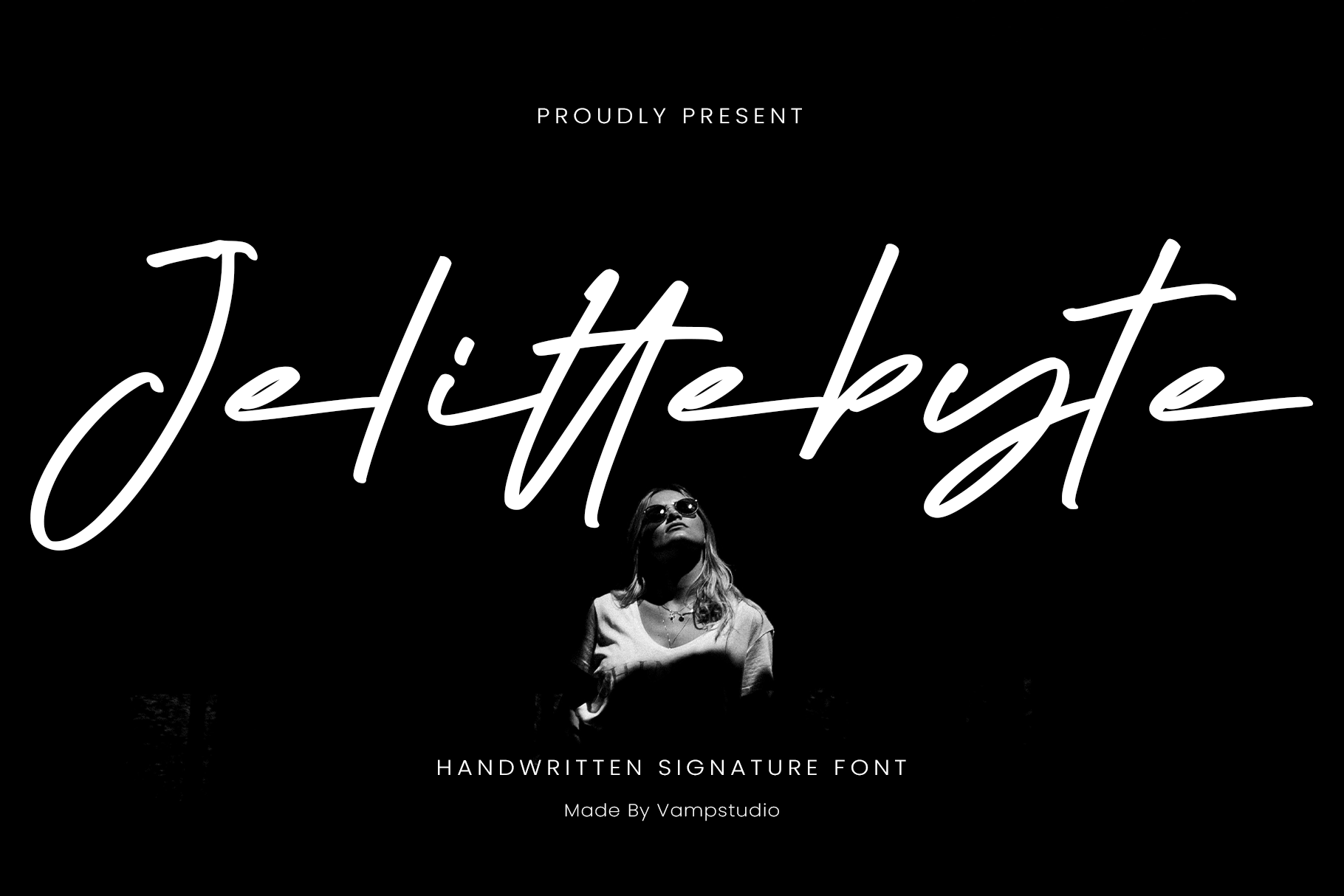
Script fonts, with their flowing and calligraphic forms, are a celebration of the art of handwriting. These typefaces, often inspired by cursive or calligraphic styles, possess an inherent sense of creativity, elegance, and whimsy.
The psychological associations of script fonts can vary greatly depending on their specific design. Some script fonts may evoke a sense of romance and sophistication, making them popular choices for wedding invitations and high-end branding. Others may convey a sense of playfulness and spontaneity, lending themselves well to children’s products or casual branding.
Subcategories of script fonts, such as Formal, Casual, and Calligraphic, each offer their own unique emotional resonances. Formal script fonts, with their intricate flourishes and ornate designs, may convey a sense of luxury and refinement, while Casual script fonts, with their more relaxed and informal styles, can evoke a sense of warmth and approachability.
Examples of script fonts and their associated psychological traits:
Buy Script Fonts at Vampfonts.com and Get 20% OFF
Each typeface tells a story, whispers an emotion, and elevates your design from mere communication to true artistic statement – visit Vampfonts.com/font-category/script/ now and use code VAMP20 to claim your exclusive discount!

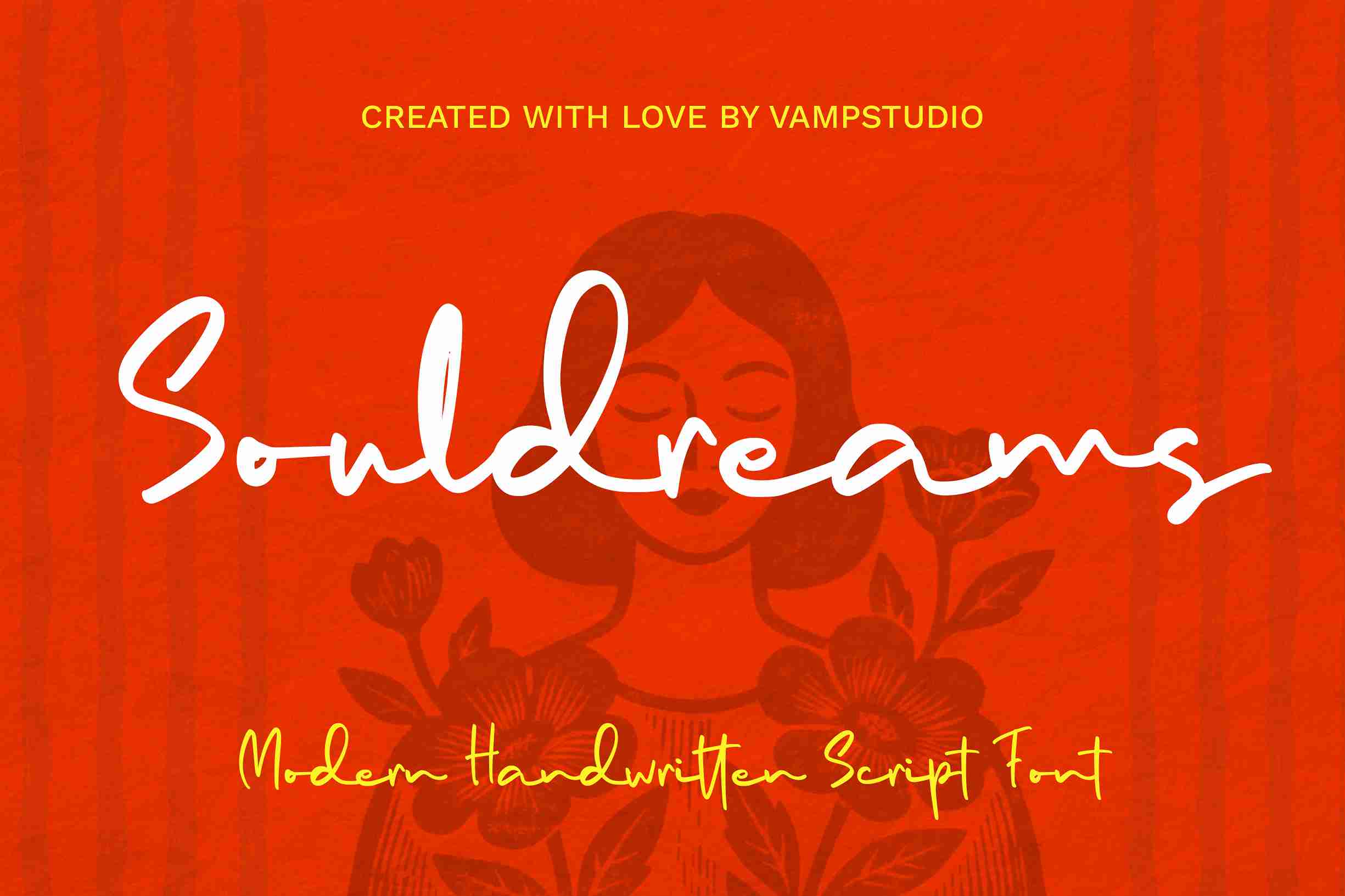
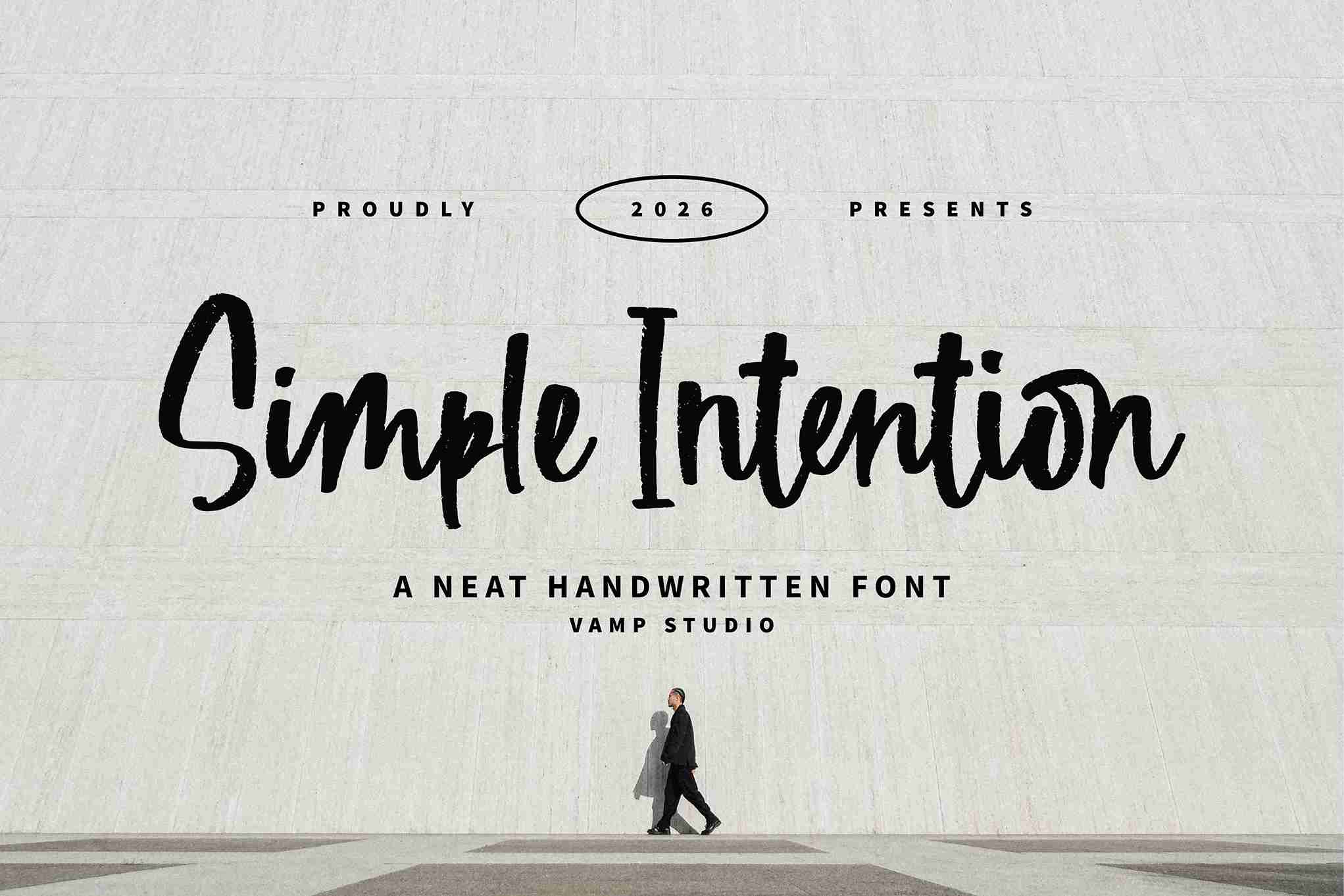

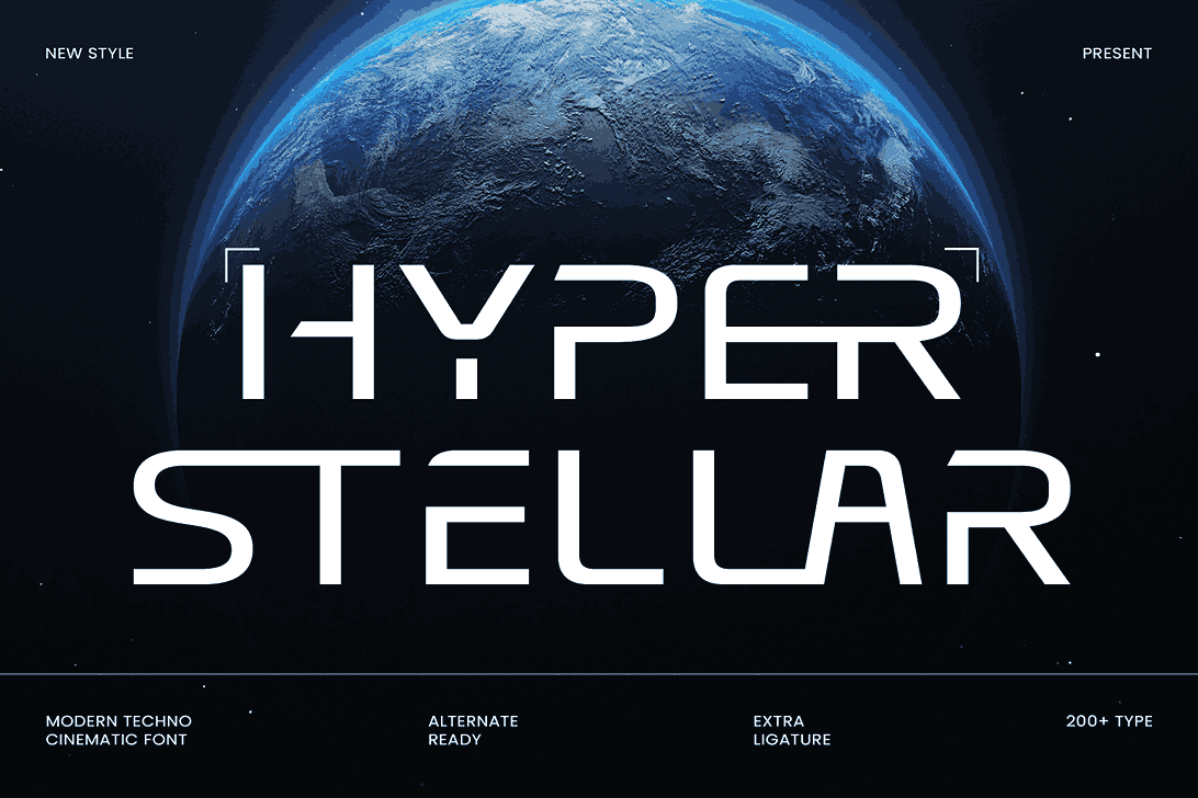
Decorative fonts, also known as display or novelty fonts, are a diverse and eclectic category that defies traditional classification. These fonts are often highly stylized, incorporating unique design elements and artistic flourishes that set them apart from more conventional typefaces.
The psychological associations of decorative fonts are as varied as their designs. Some may convey a sense of quirkiness and individuality, making them popular choices for brands seeking to stand out and establish a distinct identity. Others may evoke a sense of nostalgia or retro charm, tapping into the collective cultural memory of a particular era or aesthetic.
Subcategories of decorative fonts, such as Grunge, Retro, and Futuristic, each offer their own unique psychological associations. Grunge fonts, with their distressed and gritty aesthetics, may convey a sense of edginess and rebellion, while Retro fonts, with their vintage-inspired designs, can evoke a sense of nostalgia and sentimentality.
Examples of decorative fonts and their associated psychological traits:
While the overall style and design of a font play a significant role in shaping its psychological associations, several other factors contribute to the overall impact of typography on human perception and emotion.
One of the most effective ways to direct a reader’s attention and guide their visual journey is through the strategic use of typographic emphasis. Techniques such as bold, italics, underline, and variations in font size and color can be employed to highlight specific words, phrases, or sections of text, effectively drawing the reader’s focus and creating a visual hierarchy.
The psychological impact of typographic emphasis lies in its ability to influence the reader’s perception and interpretation of the content. By emphasizing certain elements, designers can subtly guide the reader’s attention, evoking specific emotional responses or conveying a particular message or tone.
Color is another powerful visual element that can profoundly influence our emotions and perceptions. When combined with typography, color can amplify the psychological impact of a font, creating a harmonious visual experience that resonates on a deeper level.
The psychological associations of colors are deeply rooted in cultural traditions, personal experiences, and biological responses. For instance, warm colors like red and orange may evoke feelings of passion, energy, and excitement, while cool colors like blue and green can convey a sense of calmness, tranquility, and stability.
By carefully selecting color palettes that complement and enhance the emotional resonance of a chosen font, designers can create a cohesive visual language that effectively communicates the desired message or brand identity.
The way typography is arranged and organized on a page or screen can have a significant impact on its psychological impact. Effective use of typographic hierarchy and layout principles can enhance readability, comprehension, and overall user experience, while poor implementation can lead to confusion, frustration, and disengagement.
Principles such as line spacing, letter spacing, margin sizes, and alignment all contribute to the overall visual hierarchy and flow of a design. When implemented thoughtfully, these elements can guide the reader’s eye, establish a clear visual structure, and enhance the overall aesthetic appeal of the content.
By carefully considering the psychological impact of typographic hierarchy and layout, designers can create visually appealing and engaging experiences that not only convey information effectively but also evoke specific emotional responses and foster a deeper connection with the audience.
The principles of font psychology find applications across a wide range of domains, from branding and marketing to publishing and user experience design. By leveraging the psychological associations and emotional resonances of different fonts, professionals in these fields can create more effective and engaging experiences for their target audiences.
In the realm of branding and marketing, font psychology plays a crucial role in shaping brand perception and influencing consumer behavior. The strategic selection of fonts for logos, advertisements, packaging, and other marketing materials can profoundly impact how a brand is perceived by its target audience.
By aligning the psychological associations of a chosen font with the desired brand personality and values, marketers and designers can create a cohesive and resonant visual identity that effectively communicates the brand’s essence and fosters emotional connections with consumers.
For example, a luxury fashion brand may opt for an elegant serif font to convey a sense of sophistication and exclusivity, while a tech startup might choose a clean, modern sans-serif font to project an image of innovation and progressiveness.
In the world of publishing, whether print or digital, font psychology is a critical consideration in ensuring an optimal reading experience and effective information retention. The choice of typeface can significantly impact the reader’s engagement, comprehension, and overall enjoyment of the content.
Publishers and designers must carefully consider the psychological impact of different fonts, taking into account factors such as readability, legibility, and emotional resonance. For instance, a classic serif font may be the preferred choice for a novel or academic text, evoking a sense of intellectualism and tradition, while a clean sans-serif font might be more suitable for a magazine or digital publication, projecting a sense of modernity and accessibility.
By leveraging the principles of font psychology, publishers and designers can create visually appealing and emotionally resonant reading experiences that not only captivate readers but also enhance their ability to retain and process information effectively.
In the realm of user experience (UX) design, font psychology plays a vital role in creating intuitive, user-friendly, and engaging digital experiences. The choice of fonts for websites, mobile applications, and other digital interfaces can significantly impact the user’s perception, comprehension, and overall satisfaction with the product or service.
UX designers must carefully consider the psychological associations and emotional resonances of different fonts, ensuring that they align with the overall brand identity, target audience, and desired user experience. For instance, a financial application may benefit from the use of a trustworthy serif font to convey a sense of stability and reliability, while a social media platform might opt for a more casual and approachable sans-serif font to foster a sense of community and connection.
By leveraging the principles of font psychology, UX designers can create digital experiences that not only function seamlessly but also resonate emotionally with users, fostering deeper engagement, loyalty, and overall satisfaction.
In a world where visual communication plays an increasingly vital role, the psychological impact of fonts cannot be overlooked. By understanding and leveraging the principles of font psychology, designers, marketers, publishers, and user experience professionals can create more effective and emotionally resonant experiences for their target audiences.
Whether it’s shaping brand perception, enhancing reading experiences, or fostering user engagement, the strategic selection and implementation of fonts can profoundly influence how individuals perceive, interpret, and engage with visual content.
As the field of font psychology continues to evolve, embracing its principles and staying attuned to emerging research and trends will be essential for professionals across various industries. By harnessing the power of font psychology, we can unlock new levels of emotional connection, engagement, and impact, elevating our visual communication to new heights.

