1. Vampfonts.com
  2. »
  3. Blog
  4. »
  5. Best Fonts for Label and Packaging Design

Best Fonts for Label and Packaging Design

Share :
fonts for label packaging design

In the competitive world of retail and e-commerce, packaging is often the first conversation a brand has with its customer. Long before a consumer touches the product or reads the ingredient list, they are influenced by the typography. The right font does more than just decorate a label; it tells a story, communicates flavor, establishes brand trust, and can instantly elevate a product’s perceived value.

Whether you are launching a luxury cosmetic line, an artisanal coffee brand, or a sustainable snack, choosing the best fonts for your label and packaging design is a critical business strategy. This guide will walk you through typographic psychology, the best font choices by category, formatting for different materials, and crucial regulatory compliance.

Why Packaging Typography Matters

Typography in packaging design is not merely an aesthetic choice—it is a functional and psychological tool.

  • Brand Recognition: A consistent logo and label font helps customers identify your brand across different products and marketing channels, building familiarity and recall over time.
  • Emotional Appeal: Different typefaces evoke different emotional responses. A bubbly, rounded font feels approachable and youthful, while a sleek, high-contrast serif font suggests sophistication and prestige.
  • Readability and Compliance: Packaging must clearly communicate product names, benefits, ingredients, and legal warnings. Poor typography can lead to consumer confusion or costly regulatory penalties.

The Psychology of Font Categories

Understanding typographic classifications will help you align your design with your brand’s personality.

1. Serif Fonts: Heritage, Elegance, and Trust

Serif fonts feature small decorative lines or strokes at the ends of letterforms. In packaging, serifs are synonymous with authority, tradition, and luxury. They are heavily favored in high-end cosmetics, fine wines, and premium boutique foods.
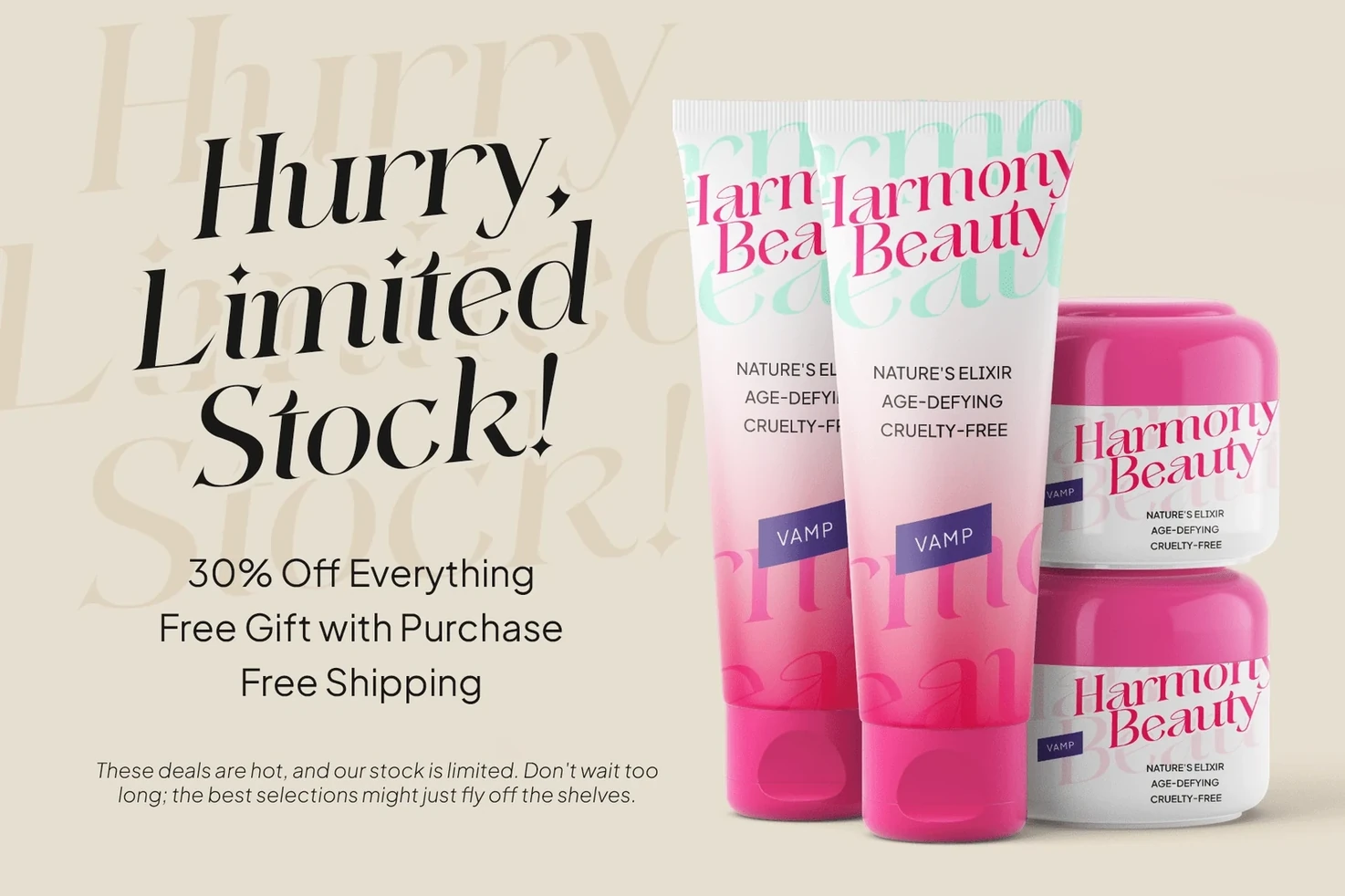
felixtowe-font-2
  • Best Serif Fonts for Packaging:
    • Felixtowe: High-contrast serifs that bring a dramatic, fashion-editorial mood to luxury cosmetics and perfume boxes.
    • Garamond: A timeless, classic choice that feels cultured, literary, and refined, perfect for handmade goods and premium wellness products.
    • Baskerville: Offers a balanced, intelligent, and credible feel, frequently used for luxury spirits and tea tins.

2. Sans-Serif Fonts: Modern, Minimalist, and Functional

Sans-serif fonts lack the decorative strokes, resulting in a clean, contemporary, and approachable aesthetic. Because of their exceptional legibility, they are the go-to choice for technology, health, wellness, and minimalist lifestyle brands.
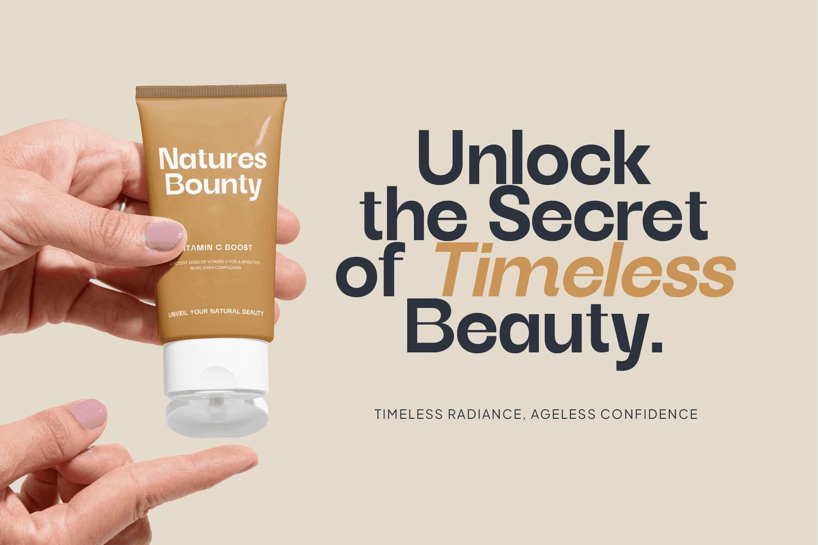
cracker-grotesk-4
  • Best Sans-Serif Fonts for Packaging:
    • Cracker Grotesk: A geometric sans-serif that projects forward-thinking confidence, making it ideal for fashion and modern e-commerce packaging.
    • Helvetica / Helvetica Now: A neutral, stable, and highly versatile font that provides ultimate clarity for everything from bold titles to ingredient panels.
    • Avenir & Montserrat: Humanist and geometric hybrids that offer a friendly, approachable, yet structured look for modern food and lifestyle brands.
    • Proxima Nova: Clean and highly legible, perfect for direct-to-consumer and wellness brands.

3. Script and Handwritten Fonts: Warmth and Craftsmanship

Script fonts mimic calligraphy or handwriting, bringing a personal, artisanal, and nostalgic tone to a product. They are highly effective for organic foods, handmade soaps, and craft beverages, though they must be used sparingly to avoid legibility issues.
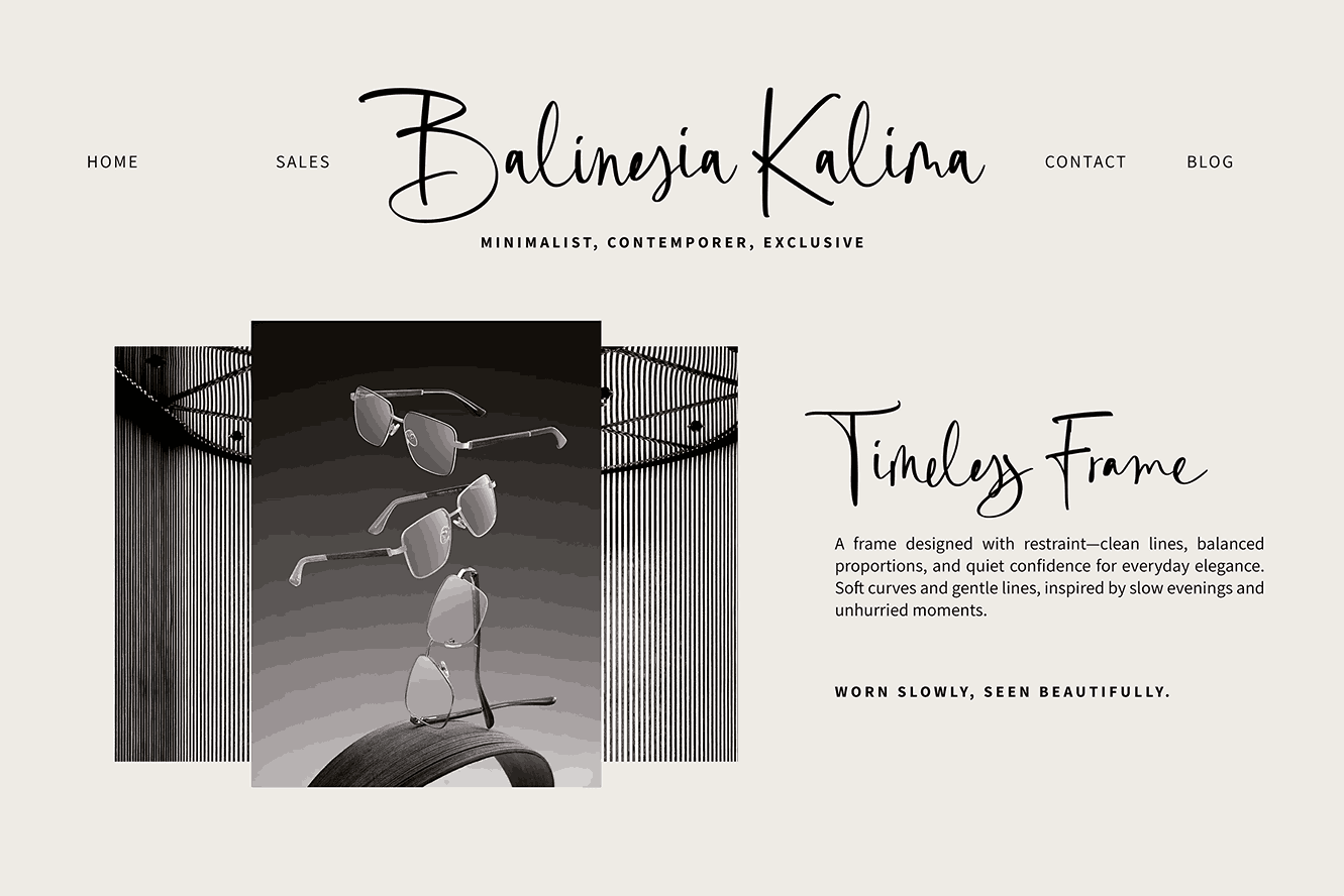
hola-berlin-preview-3
  • Best Script/Handwritten Fonts: Hola Berlin is a natural hand-made signature script that brings a personal. Crafted with an eye for fluid movement and organic textures, this typeface captures the effortless elegance of a hand-penned signature. It is an ideal choice for high-end branding and luxury packaging where a human touch is paramount.
  • Other recommended script and handwritten for label and packaging: Pacifico (rounded and playful for casual snacks), Great Vibes (flowing and romantic for candles), and SignPainter (retro diner vibe for craft foods).

4. Display and Vintage Fonts: High-Impact Distinction

Display fonts feature expressive, unconventional shapes intended specifically for large headlines. Retro and vintage display fonts are currently dominating artisan goods, craft beer, and direct-to-consumer (DTC) brands because they convey instant authenticity and establishment.
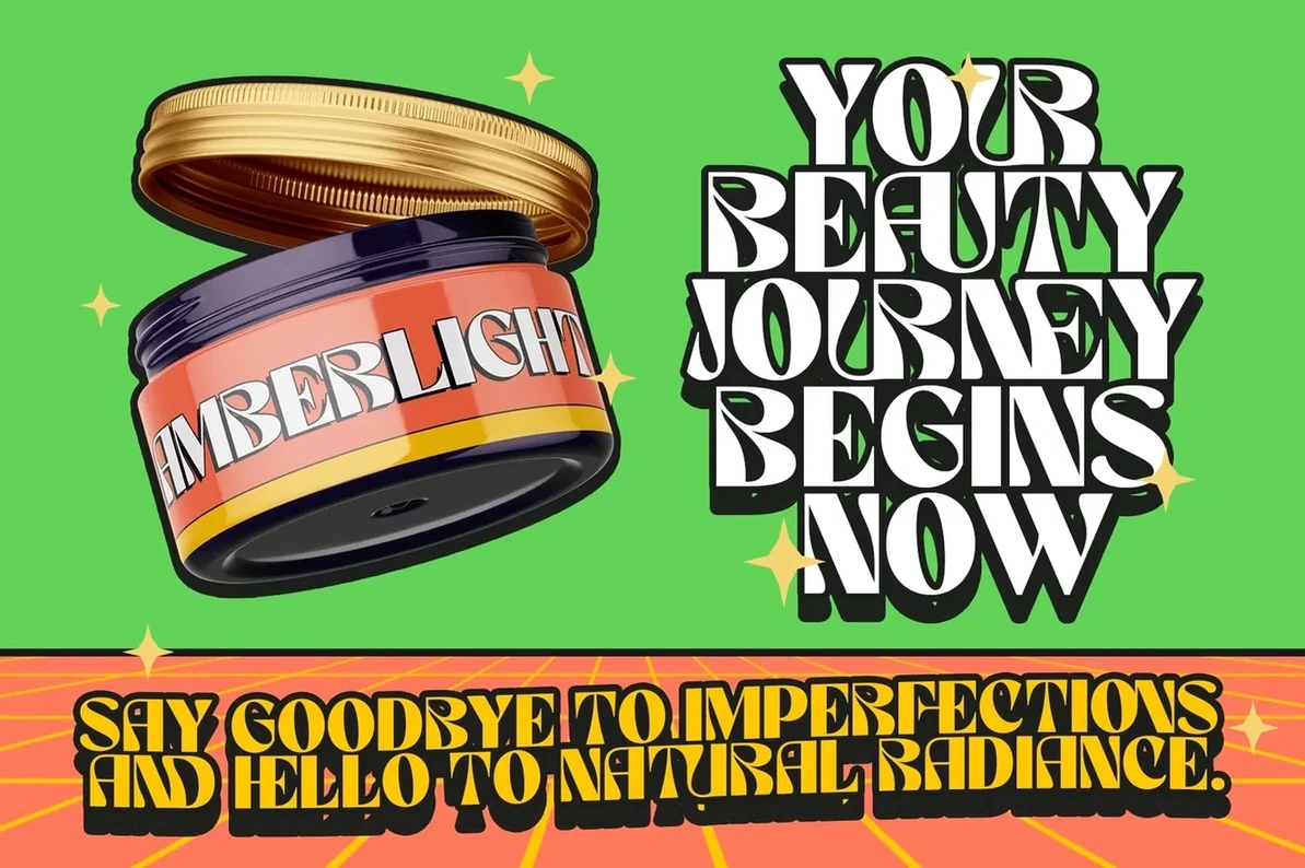
monograph-font-13
  • Best Display & Retro Fonts: Monograph 90’s Retro Display, a playful display font that captures the carefree spirit and retro charm of the 90s. Infuse your package designs with a dash of nostalgic flair and vibrant energy.
  • Other recommended display & retro fonts for label and packaging: Abril Fatface (luxurious, high-contrast curves), Flatface Henry’s (60s/70s deli signage style), and Sign Painter Sans (mid-century tavern aesthetic).

Best Practices for Packaging Typography & Font Pairing

To create an effective design, you must establish a clear typographic hierarchy.

  1. Limit Your Fonts: Use no more than two or three complementary font families per package to prevent visual chaos.
  2. Master Font Pairing: Combine a distinctive font with a functional one. For example, pair an elegant Serif heading (like Playfair Display) with a clean Sans-Serif body font (like Raleway) for ingredients. Alternatively, pair a warm Script font with a structured Geometric Sans.
  3. Contrast and Weight: Use bold weights for product names to grab attention, and regular weights for supporting text. Ensure a high color contrast between your text and background (e.g., dark text on light backgrounds); avoid combinations like red text on green, which can be illegible for color-blind consumers.
  4. Spacing: Increase tracking (letter spacing) and leading (line spacing) to ensure text does not blur into a grey block, especially on curved bottles or cans. Line spacing for blocks of text like ingredient lists should be between 120-150% of the font size.

Designing for Materials and Printing Constraints

A font might look stunning on a computer screen but fail in physical production. The packaging substrate drastically alters typography:

  • Cardboard and Kraft Paper: Absorbent surfaces cause ink to spread. Avoid hairline scripts or delicate serifs, as they will fill in or blur. Instead, use bold sans-serif fonts.
  • Plastics, Glass, and Metal: Smooth, non-absorbent surfaces hold crisp edges well, allowing for higher resolution and the use of fine serifs or complex ligatures.
  • Foil Stamping and Embossing: Delicate scripts and thin strokes can break or fill in when heavy foil or varnish is applied. Choose fonts with simpler shapes and thicker strokes.
  • Color Mode: Always export print-ready files in CMYK at 300 DPI. Be cautious of reverse printing (white text on a dark background)—it can create an optical illusion making text look smaller, so you may need to use a bolder weight.

Essential Regulatory and Compliance Standards

Packaging typography is heavily regulated, meaning your design choices must satisfy legal requirements to avoid costly recalls.

  • United States (FDA): The FDA mandates that the Statement of Identity (product name) and Net Quantity must appear on the Principal Display Panel (PDP). The Net Quantity statement has minimum type size requirements dictated by the area of the PDP (ranging from 1/16 inch for small packages to 1/2 inch for very large packages). For information panels (ingredients, manufacturer details), the font size must be a minimum of 1/16 inch in height (based on the lowercase “o”), and it must be prominent, conspicuous, and easy to read without overcrowding. Medical and pharmaceutical Instructions for Use (IFU) should utilize sans-serif fonts like Verdana or Arial at a minimum of 10 points (with 8 points allowed for certain minor details).
  • European Union (CLP & CPR): By 2026/2027, updated EU CLP regulations demand larger, stricter minimum font sizes based on packaging capacity. The lowercase “x” height must be at least 1.2 mm for packages under 0.5 liters, scaling up to 2.0 mm for packages over 50 liters.

As we look toward the future, several typographic trends are reshaping the packaging industry:

  1. The Human-AI Hybrid (Wonky Typography): To combat the sterile perfection of AI-generated content, brands are adopting intentionally imperfect, hand-drawn, and “wonky” typography to signal human craftsmanship and emotional warmth.
  2. Typography-Driven Packaging: Type is becoming the central hero of the packaging, replacing illustrations and photography. Brands are utilizing oversized, stretched, and kinetic typography to command attention on shelves.
  3. Variable Fonts: As designs adapt to multiple packaging shapes (like flexible pouches that distort text), variable fonts—which allow designers to adjust width, weight, and slant seamlessly—are becoming a highly functional asset.
  4. Neo-Minimalism: Clean layouts are being upgraded with warmer tones, bold typography, and extreme high-contrast legibility to simplify functionality for the consumer.

Selecting the best font for your label and packaging design is a delicate balance of art, psychology, functionality, and legal compliance. By understanding the emotive power of different font categories, pairing them strategically, testing them on physical materials, and adhering strictly to regulatory sizing, you can create a packaging design that not only looks exceptional but actively drives sales and consumer trust.

If you’re looking for best fonts for your brand label or packaging, explore our premium font collection at Vampfonts.com. Whether you need a bold, high-contrast serif for luxury labels or a rugged, hand-lettered look for artisanal packaging, our library is specifically designed to handle the technical demands of print and physical goods. You can search our catalog by style or use-case to find the perfect typographic match that ensures your products stand out on any shelf.

Share :

Related Post