
As we step into 2025, the world of typography is poised for an exciting transformation. Designers and brands are increasingly recognizing the power of typefaces to convey messages, evoke emotions, and establish identities. This year, we can expect a rich tapestry of trends that blend nostalgia with innovation, pushing the boundaries of traditional design while embracing the essence of individuality. In this article, we will explore the key typography trends for 2025, providing insights and practical applications for creatives looking to stay ahead of the curve.
The allure of retro-inspired typography continues to captivate designers in 2025. Fonts reminiscent of the 70s, 80s, and early 2000s are making a strong comeback, characterized by bold, expressive forms that evoke a sense of nostalgia.
Retro fonts tap into collective memories, offering warmth and familiarity. They stand out in a crowded design landscape, providing a unique charm that resonates with audiences seeking authenticity. As brands strive to create emotional connections, retro typefaces serve as a bridge to the past, allowing for storytelling that feels grounded and relatable.
When using retro fonts, balance is key. Pairing these typefaces with modern layouts or muted color palettes can create a harmonious look. They work exceptionally well in branding projects, packaging design, and website headers where a memorable first impression is crucial.
As we navigate the typography landscape of 2025, it is clear that the trends reflect a blend of nostalgia, innovation, and individuality. From the resurgence of retro fonts to the rise of variable typography, designers have a rich palette of options to explore.


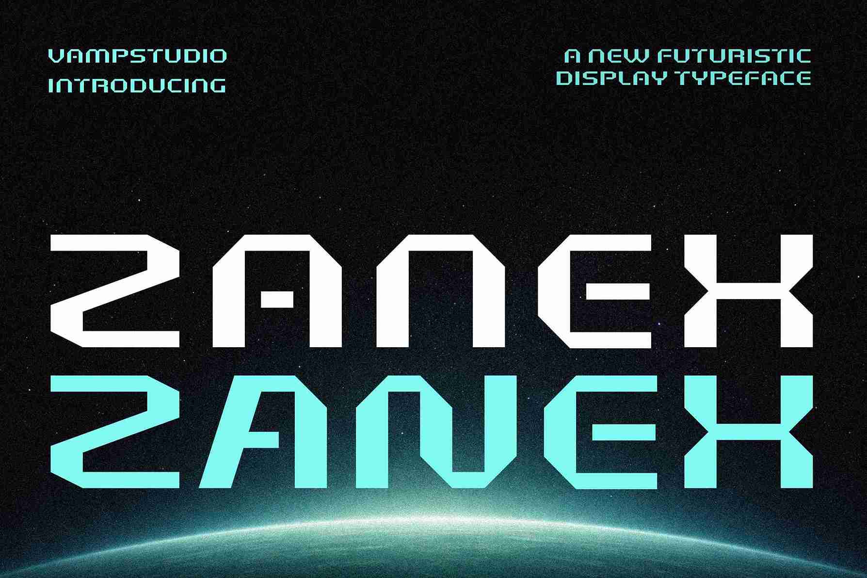


By staying informed about these trends, creatives can push boundaries and experiment while remaining true to their unique brand voice. Typography is not just a tool for communication; it is a powerful means of expression that can elevate design projects to new heights. For those looking to enhance their typography toolkit, consider exploring the diverse range of fonts available at Vampfonts.com. With a plethora of options, you can find the perfect typeface to bring your creative vision to life.
In 2025, there is a growing trend towards fonts that draw inspiration from cultural heritage and traditional design motifs. These typefaces reflect historical scripts and intricate patterns, adding depth and meaning to design projects.
Heritage fonts resonate with audiences seeking meaningful aesthetics. They convey trust, legacy, and authenticity, allowing designers to tell stories that transcend mere visual appeal. By incorporating cultural elements, these typefaces create a distinctive voice for brands.
Heritage-inspired fonts are ideal for projects where storytelling is essential. They shine in branding for heritage brands, websites for cultural institutions, and luxury eCommerce platforms. When combined with minimalistic design elements, these fonts can communicate tradition while remaining fresh and relevant.
Recommended Heritage Fonts
As we move further into 2025, designers are embracing experimental typography that challenges traditional notions of readability and form. This trend incorporates stretched letters, liquid forms, and unconventional pairings.
In a saturated digital landscape, experimental fonts allow designers to make bold statements. Typography becomes a medium for expression, adding personality and character to designs. By stepping outside conventional boundaries, creatives can capture attention and convey unique messages.
Experimental typefaces are best suited for contexts where grabbing attention is paramount. They work well in website headers, social media graphics, and promotional campaigns. However, it’s essential to maintain legibility by pairing experimental fonts with more traditional ones for body text.
The trend towards handcrafted and organic fonts is gaining momentum in 2025. These typefaces mimic the imperfections of hand-drawn or brush-written forms, offering a refreshing contrast to polished digital aesthetics.
In an age dominated by AI and automation, handcrafted fonts evoke a sense of personal touch and authenticity. They resonate with audiences seeking designs that feel human and relatable. Brands can use these fonts to convey trustworthiness and connect on a deeper level.
Organic fonts excel in logos, branding for small businesses, and packaging designs. They create an inviting aesthetic that sets brands apart in markets where warmth and approachability are key. Pairing these fonts with complementary design elements enhances their impact.
The demand for approachable typefaces is on the rise, with friendly serifs and casual sans-serifs taking center stage in 2025. These fonts strike a balance between professionalism and friendliness.
This trend reflects a broader cultural shift towards authenticity and relatability in design. Friendly typefaces foster trust and create a welcoming atmosphere, making them ideal for brands looking to connect with their audiences.
These typefaces are versatile for both digital and print projects. They work well in website headers, editorial design, and logo creation. When paired with soft color palettes and minimal illustrations, they create a cohesive and calming aesthetic.
In a departure from traditional typography, playfully wobbly fonts are gaining traction in 2025. These typefaces feature irregular baselines and varied stroke weights, creating a sense of movement and spontaneity.
Wobbly fonts bring a sense of fun and freedom to design, making them ideal for brands that want to break out of the mold. They capture attention without being overly polished, adding an informal vibe to projects.
These fonts are perfect for playful brands, children’s products, and lifestyle branding. They make strong statements on posters, social media posts, and packaging. To maintain clarity, it’s best to use them as display fonts or in short text.
High-contrast typography is set to make waves in 2025, where thick and thin strokes play against each other to create drama and sophistication.
The juxtaposition of bold and delicate elements adds visual interest, making these fonts perfect for designers seeking to make a statement. This trend balances the assertiveness of sans-serifs with the expressiveness of serifs.
High-contrast typefaces work well in branding, headlines, and any application where impact matters. They can add weight to design compositions without overwhelming them, making them ideal for attention-grabbing logos or editorial layouts.
Condensed fonts with a raw, brutalist influence are gaining popularity, especially within minimalist and modernist design circles.
These fonts project strength and clarity, resonating with designers and audiences who value straightforward aesthetics. This trend reflects a modern edge that cuts through the noise, making typography feel bold and intentional.
Use these fonts in minimalist layouts, where their condensed shapes can create a strong visual hierarchy. They are effective in web design, online portfolios, and promotional graphics, especially when paired with simple color schemes.
Akzidenz-Grotesk: A classic condensed typeface.
VG5000: A modern font with a raw edge.
Brutalisme: A striking typeface that embodies strength.
3D typography is evolving in 2025, with a focus on “inflated” or dimensional styles that add depth and movement to designs.
Futuristic fonts with 3D elements capture attention with their depth and realism. These typefaces create a more immersive experience, making them ideal for digital spaces.
3D and inflated typefaces are great for digital media, interactive content, and branding where dimensionality adds visual interest. They work well in social media posts, video titles, and website headers.
In 2025, variable fonts are revolutionizing how designers approach responsive design. These fonts allow for adjustments in attributes like weight and width within a single file.
Variable fonts simplify responsive design, ensuring consistent typography across all screen sizes. This efficiency leads to faster loading times, a significant advantage for digital platforms.
Use variable fonts for projects that demand flexibility, such as websites and mobile apps. They are particularly valuable for body text or headers, where slight adjustments can enhance readability.

