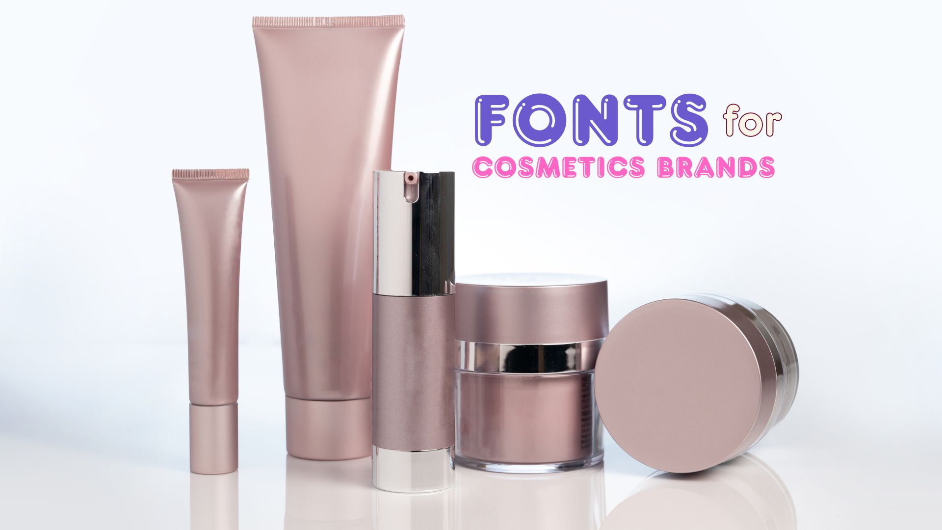
In this intricate tapestry, the art of choosing the perfect font emerges as a pivotal element in crafting a strong brand identity for your beauty business. Your typography serves as a powerful conduit, conveying your brand’s personality, setting the tone for your messaging, and leaving an indelible impression on your audience. Embarking on this journey requires a thoughtful approach and adherence to a few guiding principles.
Before delving into the world of font selections, take a moment to define the core essence of your brand. Explore its personality, values, and target audience. Is your brand’s aura one of modernity and sleekness, or does it exude a softer, more feminine charm? Comprehending these nuances will illuminate your path, allowing you to narrow down your font choices with precision.
In the realm of beauty brands, legibility reigns supreme. Ensure that the font you choose is easy to decipher, especially when employed in smaller sizes or against various background hues. Steer clear of overly ornate fonts that may hinder comprehension, as clarity should be a paramount consideration.
Your font choice should be a harmonious reflection of your brand’s identity, much like a carefully curated ensemble. If your brand exudes luxury and sophistication, a serif font may be the perfect accompaniment. Conversely, if your brand embodies a playful, youthful spirit, a script font could be the ideal canvas to capture its essence.
Remember, consistency is the golden thread that binds a brand’s identity. Once you have chosen a font for your beauty brand, ensure its consistent application across all your marketing materials. This cohesive approach will forge a memorable and enduring brand image in the minds of your audience.
In the ever-evolving landscape of beauty brands, typography plays a pivotal role in shaping consumer perceptions and forging lasting connections. The thoughtful selection of fonts can elevate a brand’s identity, imbuing it with a distinct personality that resonates with its target audience.
Fonts possess an inherent psychological allure, capable of evoking specific emotions and associations within the viewer’s mind. A well-chosen typeface can convey a sense of luxury, sophistication, or playfulness, aligning seamlessly with the brand’s ethos and desired image.
Beyond mere aesthetics, typography serves as a powerful tool for establishing brand recognition. A consistent and cohesive use of fonts across all marketing materials – from product packaging to digital platforms – reinforces the brand’s visual identity, fostering familiarity and recall among consumers.
In the digital age, the user experience is paramount. Legible and visually appealing fonts can enhance the overall browsing experience, making it easier for consumers to navigate and engage with a brand’s online presence. This attention to detail can translate into increased customer satisfaction and loyalty.
To gain a deeper understanding of the typographic landscape within the beauty industry, let us delve into an analysis of renowned brands and their font choices.
The Clarins brand epitomizes elegance with its primary typeface, a contrasted serif reminiscent of the iconic Baskerville font. This choice exudes a sense of timeless sophistication, perfectly complementing the brand’s beauty products. Clarins masterfully employs ample white space, allowing the font to take center stage in large captions, while Gotham SmartScreen fonts provide a clean and legible backdrop for body copy.
Lancôme embraces the high-contrast theme with its adaptation of the revered Garamond typeface. Hairline-thin strokes imbue the font with a sense of the highest quality, reflecting the brand’s commitment to excellence. While the navigation bar features Garamond in all caps, large captions employ a seamless blend of upper and lowercase letters. Gotham’s clean lines complement the body copy, creating a harmonious typographic symphony.
Clinique’s unique style sets it apart in the cosmetics industry. The brand’s logo font, Jorvik Informal, boasts a delightfully wobbly serif that exudes contrast and an unconventional charm. When combined with the timeless Helvetica, ample white space, and a palette of soft pastel hues, Clinique’s brand identity emerges as a paragon of modernity, freshness, and stylish elegance.
Optima, a contrasted sans typeface, graces the Estēe Lauder brand with an aura of elegance, style, and meticulous design. Its classic proportions, clarity, legibility, and subtle finesse, coupled with a tall x-height, lend an air of refinement. Estēe Lauder employs this font in a light weight, complemented by large imagery and a rich navy blue hue, creating a formal yet sophisticated ambiance.
Shiseido’s typography showcases a keen eye for precision and attention to detail. Reader Bold, akin to the esteemed Gotham font, takes center stage in the navigation menu, rendered in all caps against a stark black-and-white backdrop. The brand’s bespoke font, Shiseido2013, serves as the body copy, its high-contrast sans-serif design reminiscent of Optima with a large x-height, open counters, and wide tone.
Departing from the oft-employed Gotham, YSL embraces a bold typographic statement with ITC Avant Garde Gothic Condensed. This narrow, closed typeface exudes a sense of dominance, albeit at the expense of legibility. The ITC Avant Garde Gothic Standard variant, a geometric and mono-linear font, is employed in large, poster-like sizes, creating a commanding presence that may not fully complement the brand’s logo or finesse.
The strong, bold geometric sans-serif font, rendered in all caps, embodies the very essence of elegance and class that is synonymous with the Chanel brand. Employing a renamed version of Gotham, Chanel’s brand typography remains unwavering, with all text set in a bold weight and uppercase letters, except for the smaller body copy, which utilizes the timeless Helvetica. The masculine and feminine sections are distinguished solely by color and imagery.
On the Tom Ford website, all caps reign supreme, exuding a strong, bold, and modern appeal that resonates with younger markets seeking a sense of swagger and style. The absence of lowercase letters lends a masculine, dominant aesthetic, perfectly capturing the brand’s essence.
Givenchy, a luxury French brand renowned for its chic and creative design styles, embraces a predominantly image-based aesthetic. All caps are employed throughout the website for captions and select text elements. Sackers Gothic Light, a wide, all-caps, mono-linear font, displays over-stretched shapes, while Apercu, a sleek grotesque sans-serif with narrow proportions, provides a striking contrast to the brand’s squared emblem.
The Bobbi Brown logo, set in Univers Ultra Condensed, stands out as the sole brand to employ narrow proportions in its logo design. Embracing a minimalist aesthetic, the brand utilizes ample white space, complemented by black type and black borders, creating a stark and impactful tone. A loose hand-script font adorns select content, albeit lacking in finesse, as the bold shapes appear somewhat clumsy and undefined. Brandon Text, a geometric rounded sans-serif font, introduces a touch of softness, though its smaller sizes may appear slightly fuzzy.
Contrary to the misconception that beauty brands exclusively employ delicate hairline serifs, feminine color palettes, and glamorous model imagery, our analysis reveals a prevalence of monochrome, bold styles, and the pervasive use of all-capital letters – not only in logotypes but also in website navigation and even body text. This trend raises accessibility and legibility concerns, as text set in all caps can be visually distracting and perceived as shouting.
Surprisingly, brands like Tom Ford eschew the use of lowercase letters entirely on their websites, while nearly every brand employs all caps in their logo design. Just over half of the brands examined utilize a high-contrast font akin to Optima in their logos – an unsurprising choice. However, the remaining 40% opt for bold-weight geometric or grotesque typefaces, lending a distinctly different aesthetic. Furthermore, 40% of the brands employ a contrasted serif or sans-serif as their primary font, with a staggering 7 out of 10 brands embracing geometric typefaces.
Gotham and the high-contrast sans-serif Optima emerge as the most prevalent font choices, highlighting the remarkable similarities among many beauty brands. Surprisingly, only three out of the ten brands analyzed – Shiseido, Clarins, and Chanel – employ custom-made fonts, a unexpected revelation in an industry where differentiation is vital and imitation is rife. Relying on ubiquitous, off-the-shelf fonts diminishes a brand’s ownership and makes it easier for smaller competitors to mimic the look and feel.
The beauty market exhibits a clear divide between brands that strive for a sense of heritage through the use of serifs and high-contrast strokes, and those that embrace a bolder, more modern design aesthetic with geometric and grotesque fonts. While the latter can still achieve a luxurious feel through thoughtful design practices and clean typography, they may need to work harder to differentiate themselves from less expensive competitors.
Although serif typefaces are traditionally associated with luxury, they are relatively rare in this sector, appearing in only 20% of logos and 20% of all primary typefaces. By opting for contrasted serifs, brands like Clarins and Lancôme have cultivated a distinctive brand image and a sense of heritage that sets them apart from their bold, robust, and strong-looking counterparts that employ sans-serif typefaces.
A contrasted sans-serif typeface can exude as much elegance as a serifed font when executed with precision – a fact exemplified by Estēe Lauder’s masterful use of Optima. Standing out from the crowd can be a formidable challenge in saturated markets, underscoring the vital importance of typeface and brand wordmark choices. An opportunity exists within this sector to branch away from ubiquitous faces and achieve distinction from competitors, while also differentiating from cheaper alternatives.
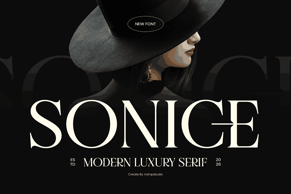
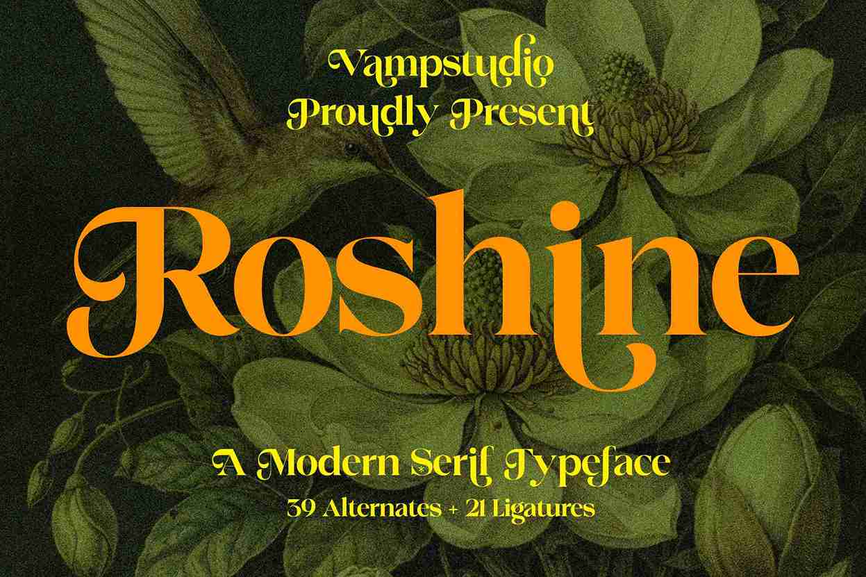
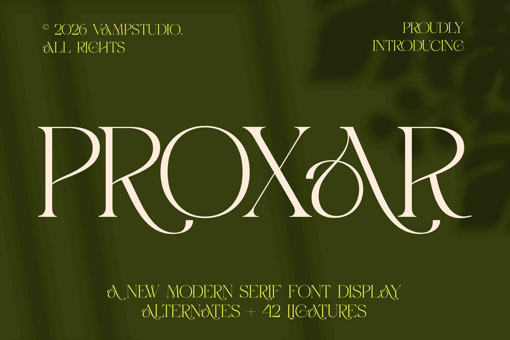
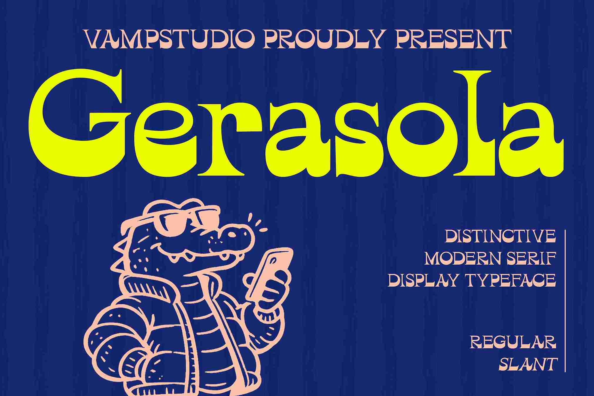
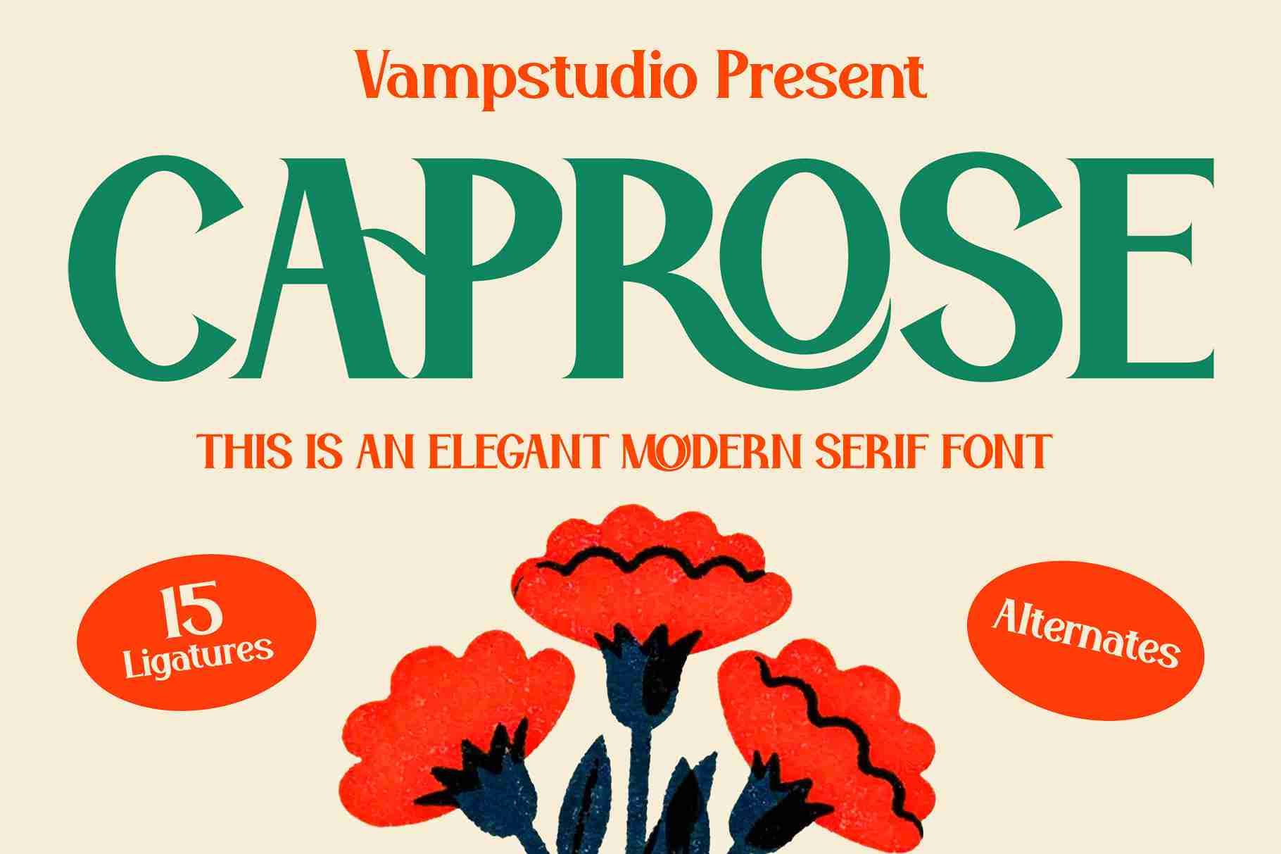

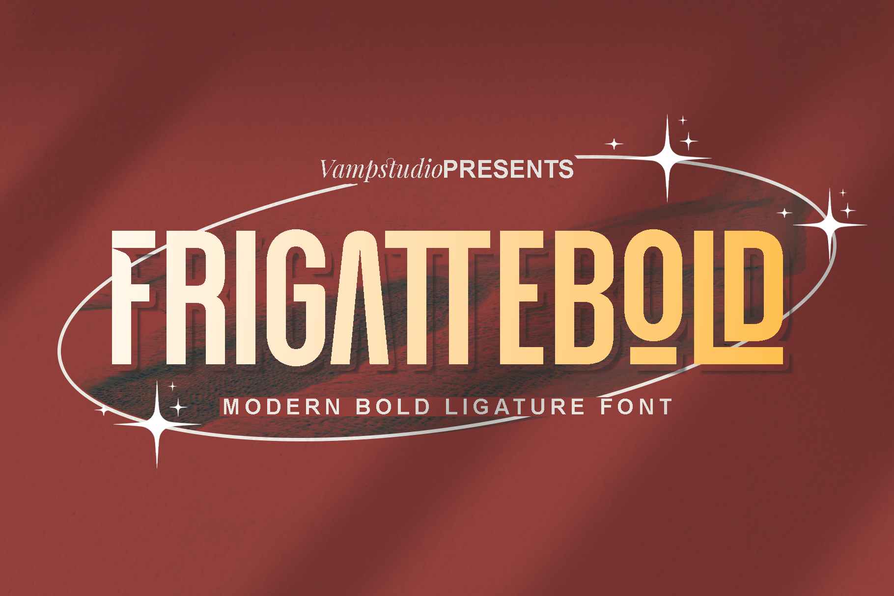
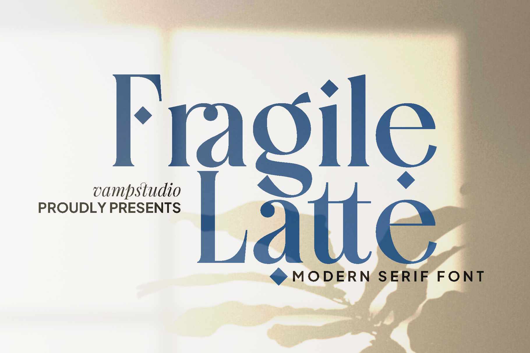

At Vampfonts.com, we understand the profound impact that typography can have on a brand’s identity and consumer appeal. Our curated collection of premium fonts offers a vast array of options, each meticulously designed to elevate your brand’s visual presence and captivate your target audience.
Explore our extensive library and discover fonts that seamlessly align with your brand’s ethos, whether you seek to convey luxury, sophistication, playfulness, or any other desired aesthetic. Our fonts are suitable for any design, brand, or industry, ensuring that your typographic choices resonate with your audience and leave a lasting impression.
Invest in the power of premium fonts from Vampfonts.com and unlock the full potential of your brand’s visual identity. Elevate your brand’s appeal, captivate your audience, and stand out in a crowded marketplace with the perfect blend of style, legibility, and brand alignment.

